How this came about
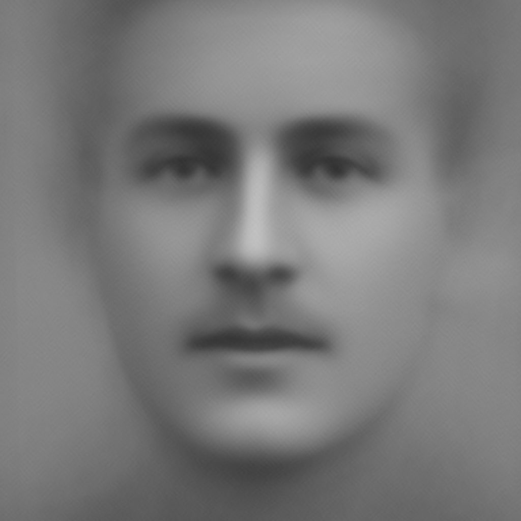
Back in January 2018 I posted some of the image-based work I had been doing on Imperial War Museum’s Bond of Sacrifice collection. As part of this I sent out a tweet with a simple animation. As a result I got chatting to Giuseppe Sollazzo (@puntofisso) who had the idea of applying the same techniques he had used to calculate the average face of a UK Member of Parliament to this set of images. After a quick exchange and providing access to the data he sent me this striking image, made up of approximately 700 of the portraits (those which the Google Vision API had shown were looking the straightest at the camera).

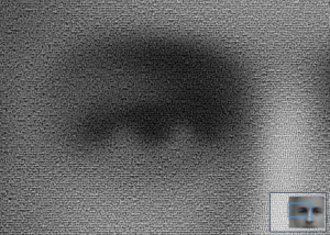
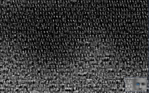
As an image, clearly it in itself is very powerful. As someone who has worked with and hence stared at those pictures individually for hours and hours I found it both eerie and captivating. Fast forward many months, and with the centenary soon coming to an end, I wanted to find a way to digitally present those feelings and also reveal the individuals that the image represented. So I wrote some code that took the average image and, pixel by pixel, found the closest matching portrait from the full collection. When you zoom in you can start to see how this works …


Not an entirely novel idea, but applying it to Giuseppi’s average image technique and using such a large, poignant dataset, feels like something that is quite impactful.
why he sent you this striking image?
susunan picture yang sangat banyak sehiingga dapat menyusun gambar yang baru. luarbiasa
What inspired you to create the code that matches the portraits to the average image, and what emotions or reactions do you hope viewers will experience when they zoom in on the image?
Visit us Teknik Telekomunikasi