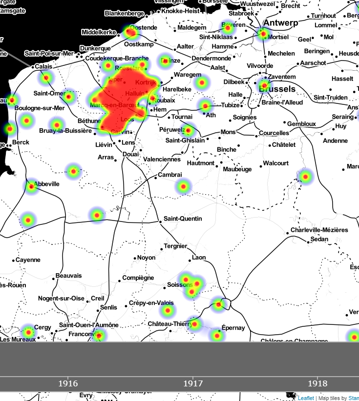
Visualising the entire dataset from Operation War Diary by time and place in a two minute animation.
When I was given access to the growing corpus of data being crowdsourced through Operation War Diary I wanted a quick way to understand what it contained. As the data, beyond the names of those mentioned, is focused around dates and locations I wanted a map that would change through time, and in looking for examples I stumbled across this animated heatmap of collision data from New York City and knew it would work perfectly.
Getting the data into the correct format was the first challenge. The dataset I had at the time contained nearly 300,000 records, with over 10,000 distinct place names mentioned, from 10th Avenue to Zwartelen. Needless to say, with historic and highly localised data, geocoding these was a bit hit and miss (I used the Google API) but I just wanted a dataset to experiment with, so the 5,400 locations I gleaned was fine for this purpose. A key point was that they represented 160,000 diary entries, so a good enough sample. An interesting side-effect of doing this was that in many cases it managed to harmonise the data – there were 10 different spellings of Poperinge alone, and the modern version wasn’t the most common!
The animation presents just the data for casualties and, obviously, only those where the place could be geotagged. I am acutely conscious how at each stage of this process the sampling and the processes may have led to biases and inacuracies, but this is presented simply to whet the appetite as I feel there is so much potential in this data.
134.213.70.206/ww1-map/

Very interesting visualization! Does it only show the northern sector of the front since the data set includes only British casualties?
Also, is there a way to weight the heat map more heavily by numbers of casualties in a single location? I feel like certain battles (the Marne, Somme, Paschendaele, etc) should stand out more compared with isolated deaths from bombings or the like. With all of these having their own bullseye at this scale, and with the persistence of the data points, it’s hard to tell the relative number at any given point.
Hi Joshua, all your observations are entirely valid – it is intended at this stage as a proof of concept and really i now need to spend some more time teasing out the details and playing with settings that control the persistence, fine granularity etc. Note I also need to bring the source data up to date as many more diaries will now have been transcribed. However, incomplete data will always be something to be aware of with this.
I do believe all the ideas you’ve introduced
on your post. They are very convincing and will definitely work.
Nonetheless, the posts are too quick for beginners.
May you please extend them a bit from next time?
Thank you for the post.